You Know It When You See It
In part 3 of my 12 in 12 challenge, I can finally report a more successful experiment. In this post, I will go through the idea, the setup, the metrics and everything I learned this time.
Published January 23, 2022
This is part 3 of my 12 Businesses In 12 Months series and this time it seems we hit something. I originally hesitated to use the standard Fake Door MVP with paid Facebook ads for validating B2B ideas, but this turned out better than expected. In this post I will
- explain what the idea was,
- the decisions we made
- and assess what I learned.
Here goes!
The Idea: Texts for Real Estate Agents with a Single Click
The product I had in mind was simple: Every real estate agent creates exposés for the properties they currently market. Texts that explain the surroundings and infrastructure nearby are always a part of that document. These texts are both very similar in structure and yet differ in the data from property to property.
The data is mostly retrievable through Open Street Maps and real estate agents already outsource parts of their exposé contents like e.g. floormap drawings.
This is not a new idea.
With my own startup Kartenhaus I not only tried something similar by generating parts of the property exposé (especially maps and infrastructure data overviews). After the acquisition of the startup, our parent company wanted us to build a very similar tool that was supposed to replace an external software which was quite expensive to use.
I am sure that the tool that I was supposed to replace is not the only one to do this, but I knew how much they charged for a single text and what their quality was.
The main value proposition then was to undercut their price and provide a no frills user experience, e.g. by entering the address of the property and getting the texts back via email within a few minutes.
The novelty for us in this experiment was to target users by a specific profession. We were unsure whether or not people are attainable to a B2B ad while browsing Facebook with their personal accounts.
You Know It When You See It
With the learnings of our last experiments, Josua and I wanted to change a few things this time:
- Make it much clearer what the product is, what it does and how it works.
- Reduce clutter on the landing page. We initially wanted to reduce it to only a hero section, but eventually went for hero, pricing and testimonial.
- Spend even less time on execution. This time, the landing page took less than 2 hours.
- Be as clear as possible in the ad. Formulate both the value, the process and the pricing.
- Decrease feedback cycle time to 2 days.
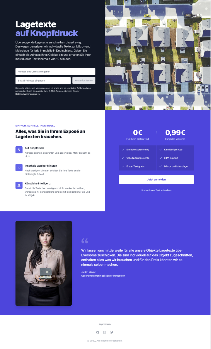
Here’s the landing page we came up with:
In the hero section, we added the possibility to enter an address (with a fancy autocomplete using Here’s Autocomplete API. Totally unnecessary, I know, but I wanted to build it) and a business email to receive a free text for the property’s address within 10 minutes.
All of the necessary interaction was above the fold. This is different from our previous experiments, where users had to scroll to a dedicated CTA section.
We then paid for ads on Facebook with our usual 40€ budget and targeted real estate agents in Germany (by interest instead of job title, which is apparently the way this works on Facebook). To reduce the feedback cycle time, we went for a 20€ daily budget instead of our usual 10€. That way, we got feedback within 2 days instead of 4. This worked out without any noticeable effect on CPC or CPM, so this seemed like a viable way.
These were our metrics:
- 20€ per day ad budget
- 2 days campaign duration
- 75 clicks
- 11 leads
- 0.53€ CPC
- 3.64€ CPA
- 8,304 impressions
Compared to our previous experiments, there’s quite a lot of difference. First and foremost, 11 leads is fantastic. That’s a whopping 14.6% conversion rate—way above what I’d ever state in an xyz hypothesis. The click-through-rate (CTR) of 0.903% was lower than what we usually see.
We interpreted this as being due to the ad being very specific and acting as a filter leaving only those who were genuinely interested in the service to click and then converting with a much higher probability.
Overall, the CPA of 3.64€ is a great baseline value and seems to provide a great opportunity for a sustainable business. When the form submissions started flocking in and the metrics were starting to look good, it really felt like this experiment was a success. We immediately knew that there may be something here. Maybe this is the great differentiator for such kinds of super fast validation experiments: You know it when you see it.
I can’t compare apples to apples, but my main take aways from this experiment are the following:
- Facebook ads are a viable way for acquiring traffic on a Fake Door MVP in a B2B setting.
- A simpler and yet believable landing page provides clarity and a more stringent user flow (reading the hero, scrolling through features, reading the testimonial, go back to the top and fill out the information).
- Condensing the ad budget on a shorter time frame does not seem to affect metrics too much and is a viable way to shorten the time to data.
What’s next?
First, a qualitative follow-up. We followed up on those leads by email and asked for an interview. So far, none of our attempts received any love.
Second, another iteration. What we could’ve done better:
- Instead of a success message and then following up, clearly manage expectations by being transparent. This will probably lead to a higher willingness to interview.
- This experiment was great for estimating interest. The skin in the game was quite low, though, because we especially stated that the first text was free. I feel like this introduced a bias and a second experiment with higher stakes would be necessary. I am still not a 100% sure about the best way to do this elegantly and reliably.
I am not sure whether or not we will do a second iteration, though. Actually building this service won’t be much fun and the learning I wanted to get out of this (does Facebook work for a B2B Fake Door MVP?) was answered. On the other hand, finding a solution on how to make the commitment more meaningful by implementing a believable fake payment would be something this business idea could still be useful for.
For now, this confirms to me that such an experiment can lead to actual data. There was definitely something there and that feels good, but I’m more eager to try something different next time.
As always, I will keep you updated.

Timothy Krechel
Innovation Consultant
Subscribe to my product journey.


