The Big Short(cut)
How Alberto Savoia’s pretotyping approach differs from the Lean world and how it proved valuable in my own experiments.
Published October 26, 2021
Since you’re reading this blog, chances are you’re already familiar with the Lean Startup movement in the flavors of Ash Maurya, Eric Ries et al. These approaches are already superbly lean compared to a classic waterfall project. But the pretotyping approach that Savoia suggests in his The Right It may provide a much faster way to validate your next big business idea. To explore this technique, I tried it myself.
I want to share my experience, so in order to do that, I will explain what pretotyping is according to Alberto Savoia, how I used his approach for my own business idea and the strengths and limits I discovered so far.
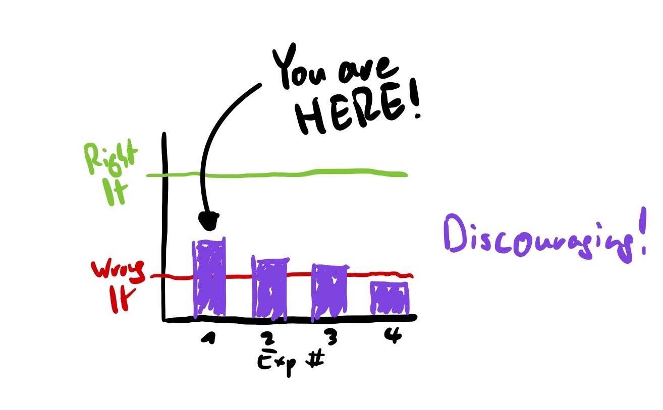
Building The Right It before building It right
In essence, what Savoia says is that it’s important to make sure you’re building the right piece of software before actually diving into building it right. The reason is that most new products will fail in the market, even if competently executed. And in order of being successful you need to have both: a product that is the right it and a competent execution
The problem with his suggestion is: How do we know in advance? How can we solicit feedback on the demand of a product without building it first?
One approach could be to ask people whether they’d buy it or not. The problem is that their opinions usually don’t count for much and people are usually pretty bad even at expressing their own desires in a product. That’s why Savoia stresses the importance of collecting one’s own data and to measure its validity through some sort of commitment (which he calls Skin in The Game). Such a commitment could be time, cash (paid on the spot or as a check) or personal information.
Enter Pretoytping
His approach to overcome this problem of needing data now but building later consists of the following steps:
- Have your business idea.
- Formulate an XYZ hypothesis, e.g. At least 20% of packaged-sushi eaters will try Second-Day Sushi if it’s half the price of regular packaged sushi.
- Transform XYZ into an xyz hypothesis by giving it a local touch: At least 20% of students buying packaged sushi at Coupa Café today at lunch will choose Second-Day Sushi if it’s half the price of regular packaged sushi.
- Conduct a set of very small so-called pretotyping (derived from pretendotyping, a mashup of pretend and prototype) experiments that validate your xyz hypothesis in a matter of hours or days. That means: Without code at all or with just a bare minimum amount of it, e.g. for a landing page.
There are several ways to conduct these experiments. As a source of inspiration, he describes techniques called the Mechanical Turk, the Pinocchio, the Fake Door, the Facade, the YouTube, the One-Night Stand, the Infiltrator and the Relabel. But any experiment or combination of approaches that works for you is fine.
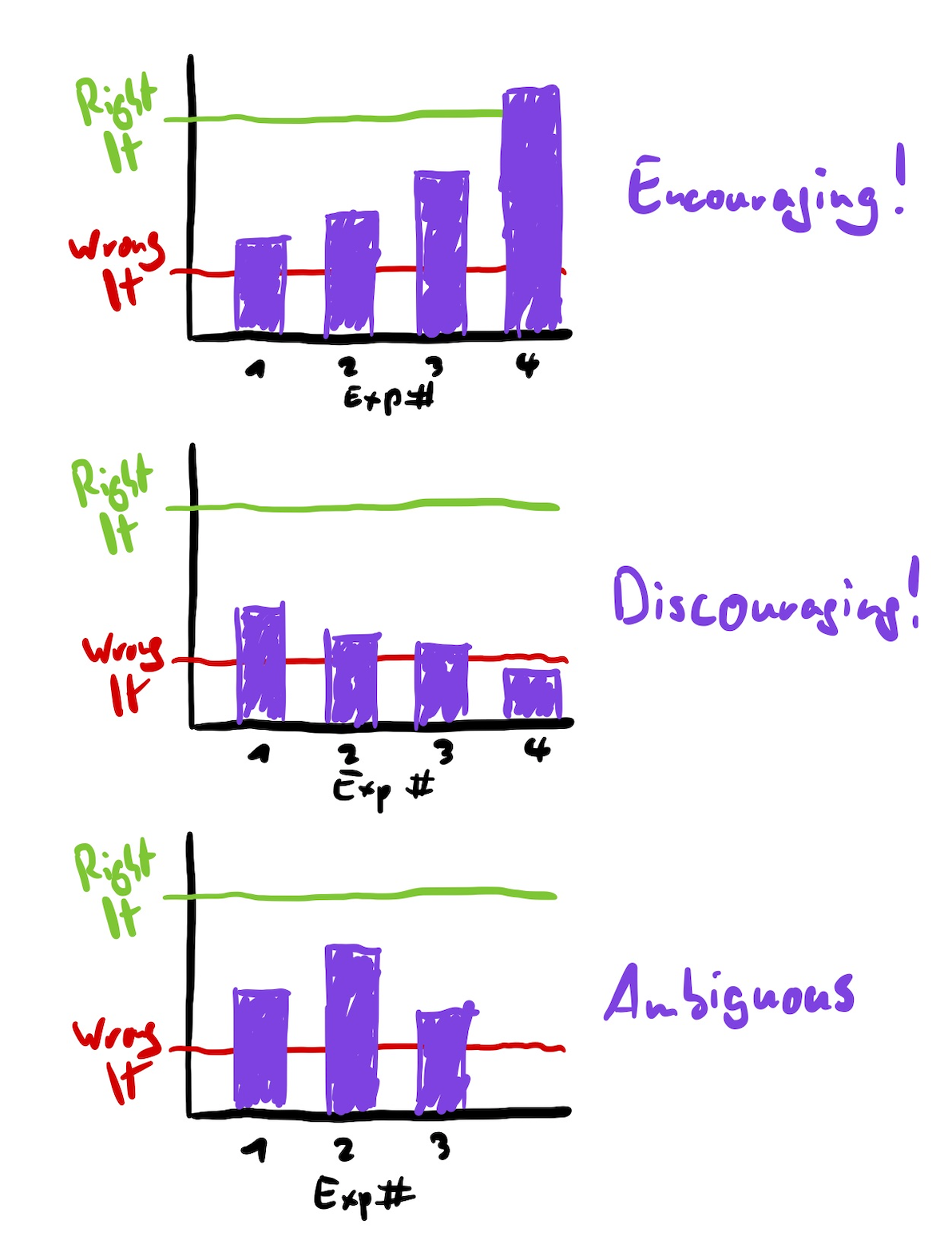
After one or two experiments, there are 3 kinds of results:
- Instant hit! People start flocking in, signing up for your service, buying the hell out of your product or booking appointments? What are you waiting for? Build the damn thing.
- Miss! People don’t seem to care. This might be due to bad copywriting, too high a price point, your value proposition just not solving any problems or anything in between. Try identifying the reasons (e.g. via analytics) and tweak your pretotype. If this occurs on multiple iterations, consider abandoning your product idea.
- Somewhere in between. Try iterating until it’s a clear hit or abandon after multiple iterations.
Woah, that’s fast!
Savoia’s pretotyping approach can be such a shortcut because it skips most of the time consuming processes of qualitative primary user research that most other frameworks suggest. To me, this has two implications:
On the one hand, this feels like a bigger bet because it’s basically rushing into a first version of the idea based on a hunch.
On the other hand, if it turns out that people sign up or even start paying for such a suboptimal version of a product, that’s a huuuge win. On top of that, at least under the right conditions and with a suitable idea, it’s really fast to conduct such an experiment.
Let’s give it a shot
After this brief explanation it’s time to get to the juicy parts of this article: A quick run-down of a B2C pretotype. For this, I will briefly go through the context, the idea itself, our setup, the results and the learnings of our first iteration, the changes and the results and learnings of the second iteration.
A bit of context
After reading the book a while ago, I was pretty stoked to try this myself. So as my colleague Josua and I were going through a few of each other’s business ideas, we figured we should sit together for a few hours over a weekend. We started prioritizing them and then going for the one that seemed to be easy, fast and cheap to pull off!
The idea we chose was the following: Put up 4 to 6 360° video cameras for a wedding to record whatever’s happening in the different rooms.
We didn’t put much thought into pains, gains or value propositions but rather just assumed that something along the lines of “never miss out on any of the funniest moments of your special day” could be met with demand.
- Our XYZ hypothesis turned out to be this: At least 5% of all wedding celebrants in Germany pay more than 4000€ for 6 360° full-length videos of their wedding.
- Our xyz hypothesis was “At least 5 out of 100 visitors to a suitable landing page leave their phone number for a customized offer.”
Setup
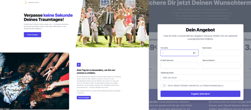
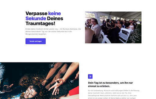
We hacked together a landing page with Next.js, Tailwind and Netlify, sprinkled some stock photos as well as a more detailed custom graphic and added a simple “reserve date” form using Netlify’s serverless Form feature. In this form, people were asked to leave their personal information to be contacted by us for a confirmation of the date they chose. This is crucial, because that data is how we intend to measure Skin in The Game.
We designed a quick logo and bought a domain for a generic brand name that we can reuse for other ideas in the future.
After that, we installed an analytics solution and bought ads on Facebook, where we targeted engaged women in Germany aged 26 to 36 on a budget of 10€ per day for 4 days total.
The numbers
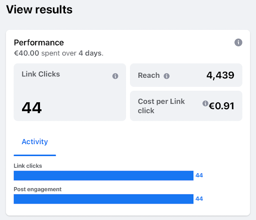
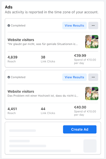
Our ad spend bought us 4,439 impressions and 44 clicks. That’s a CPC of just short of a Euro. 7 of those who clicked scrolled down to the end of the page and not a single one contacted us to book a date.
What do these numbers tell us? Well, first of all, the amount of clicks is below the 100 visitors we expected in our hypothesis. This means the data we collected bears a lot less statistical significance than we hoped for. Even ignoring this fact, the results contradict our hypothesis.
Also, our CTR is quite low, which may tell us that the copywriting and/or the image we chose for our ad is not very compelling. This is not necessarily a problem for our experiment, but it means that the costs of our experiment are probably higher than they could be. What’s more problematic is that the bounce rate is too high. There are a few potential reasons for this:
- The overall quality of the landing page could be too low for such an expensive service and an important event such as a wedding.
- The visuals are not compelling enough and do not transport the idea well enough.
- Pricing could be too high, too, but since too few people even got there, this is not too important right now.
Overall, this first experiment is indicative that this service is not The Right It. This should be discouraging, but a single failed experiment is not the end of the world for a product idea. A proper pretotype should first and foremost generate some insight about how to alter the experiment for the next iteration and only after fixing the obvious problems doesn’t change the results even after more experiments, chances are this idea really is notThe Right It.
This brings me straight to the second iteration of this pretotype. But first, I want to centralize our learnings so far: After this first experiment, we found that our analytics were not as granular as we needed to draw clear conclusions. The only data points we got were visits, bounces, scrolls to 90% of the page and filled out contact forms. To handle this, we moved to a different analytics tool to track more events on the page. This is valuable not only for the next experiment regarding this idea but rather changing the default setup for all future ideas.
As a countermeasure for the bounces, we created a short video and added it to the hero section of our landing page to make that section more sticky. If we had higher traffic, this was probably something to A/B test, but given our low absolute numbers, we decided against it.
Round 2! Dingdingdingding, knockout!
This is what the landing page looked like after we implemented the changes mentioned above:
Our second experiment brought us 4,839 impressions and 38 clicks, resulting in a CTR of 0.78%. Again, there were no conversions, but our Analytics now showed more detailed results:
2 people clicked on the CTA button, opening the modal to enter personal information, 10 people spent time actually reading our copywriting, watching the video or viewing our infographic. Still, most visitors left the page as soon as they saw the pricing section. Only one scanned the pricing section first and then started to read more about the service before leaving the page.
So again, what does that tell us? First of all, the CTR went down, indicating that the second ad text was less convincing than the first one. Again, we’re not getting the 100 visitors we aimed for in our hypothesis on a budget of 40€. Still, most of the users bounced. Among those who didn’t, the texts and visuals seemed to spark at least a bit of curiosity, but sadly not enough to drive any conversions. On top, most users were apparently put off by the high price point.
In the end it seems like this second iteration puts further weight on the conclusion that pricing is too high and further supports the interpretation that this service is not attractive enough.
This sucks! Oh, wait, it doesn’t…
If this was a product idea that we were really fond of, these results would’ve been pretty disappointing. But since we did this primarily to learn how we can leverage Facebook ads for getting data on demand fast for a B2C product that’s targeted at a very specific audience, this proved invaluable.
In a real situation, 2 iterations that are based on short of a hundred clicks total are probably too few to call it quits already. At least a few people seemed to be interested in this kind of service and were ultimately put off by the pricing. Adding a lower entry-level option or lowering the pricing overall could potentially increase actual leads. This would likely change the projections of the hard business metrics such a service could generate and, depending on the context, may be a dealbreaker.
And this is exactly the point why this kind of problem is actually a good one to have: Getting a feel for the viability of a solution and its metrics (like CPC, CTR, conversions and pricing) before investing sums that hurt is a huge advantage.
Lastly, the difference in the interpretability of the second iteration compared to the first one convinced me to never conduct such quantitative experiments (or even launch a software product) without detailed analytics ever again.
Bullet Dodged
If the alternative approach had been to just go for it and rent (or even buy) the necessary equipment, get a shiny landing page, print business cards and hire sales staff, that could have ended badly.
In the lean world I would likely have conducted problem interviews that would have taken some time to schedule and, since it is such a niche idea, a lot more to find the necessary interview partners. I don’t want to give problem interviews a bad rap, though, as they are invaluable for their own reasons and just a different methodology for product discovery.
We were painfully slow with this experiment and we were also a bit too elaborate than necessary, even though we cut corners almost everywhere. Setting up the landing page, domain, CD pipeline, analytics and ads initially took about 10 hours of our time, plus coming up with the visuals and copywriting. But having this set up once will eradicate a big chunk of the necessary work for the next idea, speeding up things significantly.
With this at hand, Savoia’s promise of hours to data seems very doable and I’m glad to have this approach of product validation in my tool belt. To save you the hassle of the initial setup, I will share the boilerplate code for this experiment in one of the next mails to the subscribers of my newsletter. So feel free to sign up!

Timothy Krechel
Innovation Consultant
Subscribe to my product journey.
